
As the Overground has grown, calls have increased to provide its sub-lines with clearer identities of their own. Behind the scenes, TfL have been working to do just that. Those new identities have now been revealed.
The Orange
“But I thought it was all going to be orange.”
These were the words that ensured that the London Overground, when it launched in 2007, would be a single colour – orange – on the Tube map. They were uttered by then-Mayor Boris Johnson in his office at City Hall.
TfL’s original plan had been to give the lines more of an identity somehow. Perhaps not in name – not in the early stages when there were less sections directly under their concessionary control – but at least in terms of colour.
Picking colours had always traditionally come towards the end of a new line’s design stage though. And until then they still needed to be indicated in some way on the various maps and documents that passed through people’s desks. This had been the case with the new sections of Overground that TfL had managed to pluck from the control of the DfT. Most notably the North London Line (NLL), which had been run into the ground by its previous post-privatization operator, Silverlink. Silverlink’s operators had never wanted it, but it had been bundled with other sections of railway that they did want. So they had no choice. It had been an unloved and under-developed line, until TfL finally secured its control.
With the support of Olympic funding, the redevelopment of the NLL and the East London Line (ELL) had begun. Indeed it was perhaps the ELL that had caused the “holding” colour for the new combined operation to be orange – it had previously appeared on maps as a sort of muddy orange, on the map, bordering on brown.
Whatever the reason, it turned out that day in the Mayor’s office that Boris Johnson had assumed the colour was deliberate. And final.
So that’s what it became. The Overground would all be orange. It wasn’t a bad colour, after all. It stood out. It passed accessibility. It certainly made a statement and (rather handily) it meant no one had to repaint or update a lot of panels at various ELL stations. The colour there was already a close enough match in the right light (take a look at the panels on the platforms at Wapping to see the evidence of this).
The Turquoise
It would be easy to be outraged that the colour for the Overground was decided in such a frivolous way. But the reality is that Tube colours – and names – have always been picked on more of a whim than most people think.
For many years, for example, a story circulated that the colour of the Waterloo & City line was chosen because it matched the dress of a legal secretary who had worked on its transfer over from British Rail. She had worn it to the project party to celebrate the completion of the process, the tale went, and the project team thought she was rather attractive in it. So when they saw something close to that colour, it was fresh in the memory and they went with that.
It’s a story that has the ring of a pub tale about it. A railway myth. It reads too well and too conveniently, with the exact hint of low-level workplace sexism one would expect to find in a story that circulated among older railwaymen over beers after work.
So many years ago, we actually embarked on a mission to try and track the origins of this story down. After all, we thought, there’s enough clues within it that it’s possible – with a bit of lateral thinking and access to the right records – to at least disprove it. Especially as TfL were unable to confirm the origins of the colour themselves. If nothing else, we could at least kill off this myth.
Which is how, some weeks of detective work later, this author found himself chatting on the phone to a senior city lawyer who, with some amusement, confirmed that the Waterloo & City line was turquoise because of her.
The real story was close to the myth, she explained. It just needed the sexism stripped out of it. That was the part that had twisted the story over the years. As a junior lawyer she had worked as part of the transfer team. It had actually been one of her first jobs in transport law. And when it came time to pick the colour of the line, her colleagues had offered her the honour of doing so. Partly as a thank you for her work on what was a complex legal project. Partly because they thought it would be a nice way of marking the beginning of her career. Nobody else would know that was why it was that colour. Nobody would likely ever ask. But it would be a fun reminder for her, they said, so why not?
She agreed, and was shown a selection of pre-approved colours by the London Underground design office. Any of them would work, she was told. So just pick one. Noticing that one was quite close to turquoise – her favourite colour – she simply chose that.
Did she have a dress in that colour?
Of course, she confirmed. It was her favourite colour. But she doubted any of the team would ever have seen her in it. She wasn’t in the habit of partying with random, older male colleagues.
The new names and colours
As the two stories above show, line colours – and names – have always been somewhat arbitrary and random. So whatever names TfL had opted to use for the newly split Overground – and whatever colours – could never be “wrong”. Because there have never been any rules to break. Similarly, Londoners will always shorten any name that a line acquires to make it roll off the tongue quickly.
But this doesn’t mean that line names don’t matter. Or rather, that they can be made to matter if they are done right. Naming a line is a rare opportunity.
In the novel Going Postal, the fantasy author Terry Pratchett described a world where communication took place through a network of semaphore towers known as ‘The Trunk’. Along the Trunk, occasionally, would pass messages that were never officially recorded. Those messages, it turned out, were names. Names of people who had died in service to the network and which now circulated perpetually on it.
“You know they’ll never really die while the Trunk is alive.” The character of Moist von Lipwig mused. “it lives while the code is shifted, and they live with it, always going home.”
“A man is not dead while his name is still spoken.”
Cities are not men. But they are alive. They live through the people who call them home and through the events they experience. Both good and bad. People move on, times change but on some level the city… on some level London remembers. And that is what binds us, as Londoners, together. It is our most common ground.
The names and colours of the new lines are below, alongside the reasons for each one. We pass no opinion on them. We have no doubt many people will. And that’s fine. What we will say, is that they all refer to something about this city – our city – that does deserve to be remembered.
Visibility matters, and there is nothing more iconic, and visible, than the Tube map.
The Lioness line: Euston to Watford Junction. The Lioness line, which runs through Wembley, honours the historic achievements and lasting legacy created by the England women’s football team that continues to inspire and empower the next generation of women and girls in sport. It will be yellow parallel lines on the map.
The Mildmay line: Stratford to Richmond/Clapham Junction. The Mildmay line, which runs through Hoxton, honours the small charitable hospital in Shoreditch that has cared for all Londoners over many years, notably its pivotal role in the HIV/AIDS crisis in the 1980s, which made it the valued and respected place it is for the LGBTQ+ community today. It will be blue parallel lines on the map.
The Windrush line: Highbury & Islington to Clapham Junction/New Cross/Crystal Palace/West Croydon. The Windrush line runs through areas with strong ties to Caribbean communities today, such as Dalston Junction, Peckham Rye, and West Croydon, and honours the Windrush generation who continue to shape and enrich London’s cultural and social identity today. It will be red parallel lines on the map.
The Weaver line: Liverpool Street to Cheshunt/Enfield Town/Chingford. The Weaver line runs through Liverpool Street, Spitalfields, Bethnal Green and Hackney – areas of London known for their textile trade, shaped over the centuries by diverse migrant communities and individuals. It will be maroon parallel lines on the map.
The Suffragette line: Gospel Oak to Barking Riverside. The Suffragette line celebrates how the working-class movement in the East End fought for votes for woman and paved the way for women’s rights. The line runs to Barking, home of the longest surviving Suffragette Annie Huggett, who died at 103. It will be green parallel lines on the map.
The Liberty line: Romford to Upminster. The Liberty line celebrates the freedom that is a defining feature of London and references the historical independence of the people of the borough of Havering, through which it runs. The name references the borough’s motto and historical status as a royal liberty, an area that traditionally had more self-governance and autonomy. It will be grey parallel lines on the map.
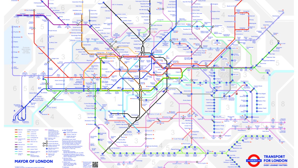
The Autumn 2024 Tube map, showing the new line colours
We had previously looked at the evolution of the devolution of railway lines to London Overground, their lengthy and cumbersome official TfL line identifiers, and their commonly used line names. As well as the 2023 TfL process and criteria for Overground line renaming and colour selection. We then ventured a guess at the potential line names and colours – we were off on all of them, although we picked some of the new line colours correctly.
The post The Big Split: Overground Line Names appeared first on London Reconnections.