
With discussion of ticket office closures and rail passenger numbers a political hot potato, it’s easy to forget that firm data on the state of rail in Great Britain does exist. We take a look at the ORR’s latest figures (April – June 2023) and TfL’s recent Crossrail Usage report.
One of the roles of the Office of Rail and Road (ORR) is to provide statistical analysis of UK rail usage. Just as critically it’s to ensure the methodology used is sound, and that (where possible) the data is delivered in a way that allows useful comparisons with previous periods.
This has been something of a challenge in recent years, thanks to a number of factors. The pandemic still casts a long shadow, as does the period of drastically reduced rail usage it created. This reduction was for relatively obvious reasons, with government-mandated lockdowns and managed capacity reduction playing a huge part. It is for this reasons that critics of the railways or railway investment, and the Treasury, like to point to year-on-year (or period-on-period) comparisons that include the pandemic as evidence of overall demand reduction. This has been particularly true within the areas of government pushing for ticket hall closures. The existence of a period of significantly reduced usage is awfully handy if you’re looking to find figures that match your plan, rather than a plan that matches your figures.
This is, ultimately, what makes the work the ORR does so useful, because a considerable amount of work has been put into ensuring that its comparisons are useful and actionable rather than numbers with no context. Doubly useful because the pandemic did create reduced customer willingness to travel by rail, and the true impact of the latter is something that the ORR and other sources have long sought to tease out.
Post-COVID vs Pre-COVID rail levels
As the above remains the elephant in the room, it makes sense to tackle this aspect of the current data release first. The headline figure is that rail usage continues to march firmly back towards pre-pandemic numbers. Between 1st April and 30th June 2023 there were 390 million rail passenger journeys. This represents 89% of the same period of traffic pre-covid at 437 million (April to June 2019).
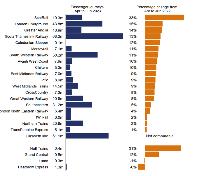
Just as importantly, this increase has not yet shown signs of tailing off. Indeed one of the noticeable aspects of the current data release is that ORR have made the decision to finally move from using pre-pandemic traffic estimates of the same quarter for comparison, to using the same quarter in the previous year. This is a useful return to “business as usual” as it means we have figures for April to June 2022 as well. From these, we can see there was a 19% increase year-on-year in rail usage in the same period (up from 328 million journeys). Despite all the ongoing issues, rail use has definitely been ‘bouncing back’.
A full breakdown of those increases is provided below. It’s worth bearing in mind when narratives of rail use being in decline, or of the need for managed decline, are mentioned.
Comparing the Elizabeth line
You’ll note that the Elizabeth line lacks a comparison on the graph above. This is because although the Elizabeth line has already cemented itself firmly into London’s collective consciousness, it is still only a year out from the opening of its central section in May 2022, and the through-running that came with that. Indeed the opening of that central section, and the need to now incorporate its figures effectively into national rail figures, has proven something of a headache for ORR.
We’ll explore why this is shortly, but in the meantime it is particularly useful to see where the Elizabeth line currently stands in comparison to its pre-pandemic usage predictions. This is because a lot of TfL’s (and the DfT’s) funding agreements and loans were based on those usage assumptions. For this, we can turn to a TfL Board Paper from July this year, which gives some idea of the general trend. The opening of through-running means they have now begun to evaluate actual vs anticipated Elizabeth line comparative usage themselves.
It’s early days, as TfL themselves caution those reading the paper to bear in mind, but as can be seen from the graph above, current Elizabeth line journeys seem to be trending against the TfL/DfT ‘post-pandemic optimistic scenario’, and may well be exceeding that. To quote TfL:
Were the number of passenger journeys observed since the start of east to west through running continue for a year, then annual passenger journeys would be 170 million per annum. A faster post pandemic recovery and the changes associated with Stage 5c [The current timetable] could see this reach 200m journeys per annum.
TFL rEPORT
To provide some quick markers on what impact through-running has had in real-terms, Tottenham Court Road is now dealing with 175,000 passengers a day (159% of previous numbers), Bond Street 230,000 (131%) and Farringdon 280,000 (280%).
It is worth noting that if these figures hold firm, then the Elizabeth line is on course to be revenue-positive for TfL by the end of this year.
How do you solve a problem like the Elizabeth line?
Moving back to the ORR data, it’s the Elizabeth line – and calculating its actual impact on UK rail figures – that forms a considerable part of the release. This release sees some of that usage data refactored, and hints that this relates to technical issues with the LENNON (Latest Earnings Networked Nationally Over Night) ticketing and revenue system managed by the rail industry, which affected Elizabeth line data more than most. This is important, because LENNON forms the basis of the usage figures across the whole UK.
This has, to a certain extent, confirmed some lingering suspicions held within LR Towers for a while. Those suspicions were that something must be up with the LENNON data for the Elizabeth line. It certainly didn’t match TfL’s own figures, which often seemed much lower. Our suspicion was that TfL’s numbers were more accurate, and it certainly seemed that the DfT agreed as it had mostly been using TfL’s numbers where appropriate or necessary.
That this has now been identified and actioned shows the ORR’s commitment (and that of its new chief statistician) to ensuring that the numbers they produce are the best they can be. The short version is that it’s a consequence of LENNON being, ultimately, an accounting tool first and a source of useful transport data second. Combine that with the labyrinthine fare and ticketing system in the UK, and you end up with an output that struggles to report correctly on Contactless and Oyster Pay As You Go journeys as opposed to straight up point-to-point ticket purchases.
Historically, this hasn’t really been an issue in terms of national rail data, as the impact was confined to TfL services – many of which (such as the Tube or DLR) aren’t covered by these releases. So smart card based, flexible travel – in which the passenger can just trust they’ll pay the right fare, and the democratization and increased travel this facilitates – has been something the national data set has been able to quietly ignore. The Elizabeth line is a mainline railway masquerading as a metro. As a result, that issue can no longer be ignored.
One might think that the above paragraph might apply to rest-of-UK ticketing itself. Not just its data. You might think that, reader, but we could not possibly comment.
The net result of all this is that ORR has accepted that TfL’s data is more accurate. And now that it is being generated in sufficient quantities, post-through-running, this will form the basis of future reporting. ORR are working with TfL to ensure that it is suitably comparable and can be integrated with the LENNON data from elsewhere.
Given that the inconsistency between TfL and LENNON data has been clear for a while, in most places where it was important the TfL data was being used already. This will now be reflected in ORR data going forward though. This is good, but it does mean that we’re likely to see a 20 – 40% decrease in the numbers the ORR publish related to the Elizabeth line, as they ‘right-size’ their dataset. This should have little practical impact, and deliver significant benefits to all, but readers are warned to watch for headlines or suggestions that the Elizabeth line has suddenly ‘lost’ passengers. As can be seen from the numbers covered above, and TfL’s own data, this isn’t true. It’s simply bad statistics being corrected. Nonetheless, beer-based bets have been made in LR Towers as to which mainstream media sources will fall into that trap (voluntarily or not) if they spot the difference.
For those interested in the real detail behind the LENNON issues and steps being taken to overcome them, the ORR have published an updated Methodology, which includes a good discussion of them. You can read that Methodology report on their website. We found it fascinating – but then, we would.
Split-ticketing: The rail industry’s dirty secret
One other aspect of British ticketing that the LENNON issues – and the ORR report – have now highlighted is the increasing impact of split-ticketing.
As we’ve already discussed, fares and ticketing in the UK are historically (and horrifically) over-complex outside of London. Not only does the system comprise a variety of peak/off-peak and differentiated price models, but it lacks a simple universal smart card system outside of the area’s of TfL’s control where Oyster and its Contactless replacement/parallel dominate. It’s worth noting, for new readers, that this situation has been worsened, historically, by the DfT’s refusal to allow the adoption of Oyster outside of those areas, even where the operators desired it. Reading is an interesting example of this, where some years back the DfT didn’t just resist plans to see Oyster implemented on the town’s local bus network, but actively blocked them.
One key consequence of the above, however, has been the gap in the market created for websites like The Trainline to offer ‘split ticketing’ options to passengers. Split-icketing sees the passenger input their full journey, with the site or system then calculating the best way to break down that journey into smaller parts. These smaller parts are calculated to maximise the local and operator variance in ticket pricing to ensure you can stay in the same seat for your full journey, while actually paying less than if you had simply bought a point-to-point ticket between your start and finish points.
That a small industry has started to grow around split-ticketing is arguably the biggest sign of how fundamentally broken, and hostile to passengers, national rail ticketing in the UK is. What is worth noting here, however, is that not only are the general public becoming more aware of the option, but also actively using it.
That this is the case is evidenced through increasing disparities between passenger journeys and passenger kilometres in the ORR dataset. The difference between the two (and the data and insights created by the latter) are too lengthy to get into here, and we will try to look at them in a separate article at a later date. But it’s clear that the ORR have become increasingly worried that split-ticketing – as with TfL’s ticketing – may have a long term impact on how journeys are reported (leading to over-reporting) if ways of tracking and representing it better aren’t made now.
This is interesting in and of itself, but what is more interesting (and worth noting here) is that ORR asked the Rail Delivery Group (the collection of train operating companies responsible for running all UK rail franchises) to give them a genuine estimate of the current level of split ticketing across the network for this release. According to those figures, split-ticketing accounted for 5% of all passenger journeys on the UK rail network between April 2022 and March 2023. This represented an increase on the 3% estimated for the previous year.
Split-ticketing is clearly not something that, as some operators likely hoped, will be quietly going away. If anything, the general public is getting smarter and now that using it can, in many cases, be as simple as checking a box on a website when they buy their ticket, they’re embracing it.
Returning to the Elizabeth line
There is much more we could dig into in this report, and hopefully we will get a chance to do so. But for now the last thing we’d like to note is that the current data set once again highlights the disparity between the London region and the rest of the country in terms of rail provision.
In the public narrative, this continues often to be framed either as an investment issue or one that relies on a grossly insulting and reductive suggestion that somehow ‘the north’ is both a homogeneous entity and also one that wants road infrastructure over rail infrastructure.
The ORR data highlights, yet again, that where rail infrastructure is built – even post-COVID – it is used. The figures show that this is true across the whole country, even where the current provision has gotten considerably worse (TransPennine and Northern, we’re looking at you) as a simple look again at the graph posted towards the head of this article shows.
The Elizabeth line also stands as testament to that. At 51.1m (rightsized) journeys from April to June 2023, it carried 13% of all rail travel in the UK between April and June 2023. Some of that travel is extrapolated from other, existing lines or TfL services but that number has continued to grow significantly since then, as TfL’s own reports are showing, and as yet shows no sign of slowing. As a result it is entirely possible that the next ORR report in December will contain figures in which the Elizabeth line represents 20% or more of all UK rail travel.
There is a reason that those hostile to rail investment are also those who tend to highlight the amount of it that’s spent on it in London and surrounding areas. This is because it allows the false narrative to be pushed that major rail projects are fixed-pot spending. That funding is a zero-sum game where all projects compete for the same budget, and that Peter from Manchester has to be robbed to pay for Paul from London’s trains. This isn’t how funding large infrastructure projects – that run into billions of pounds – works.
In the simplest terms, for those projects funding is always about borrowing. Whether that borrowing is from the private sector or via government lending (local and national). That borrowing is based on the economic potential for the investment to be paid back, regardless of what else might be underway.
In essence, the only barrier to both Peter and Paul receiving better railway services is whether they independently make economic sense.
These ORR figures once again highlight that the level of investment in large scale rail infrastructure projects nationally should be increasing, not decreasing, and that canceling those projects already under way without concrete, detailed alternatives does immeasurable harm to the economic and social improvement of the areas affected.
The desire and need for rail travel, and shifting modes of working, have not diminished demand across the country. The opposite is true.
“If you build it, they will ride.” Continues to apply nationally, not just in London. These latest data releases highlight that. It is the political will, and the inflexibility of the Treasury’s approach to project sign-off that represent the barriers to infrastructure investment across the whole country. Not a lack of demand or socio-economic benefit.
The post The State of Rail: Breaking Down The Numbers appeared first on London Reconnections.